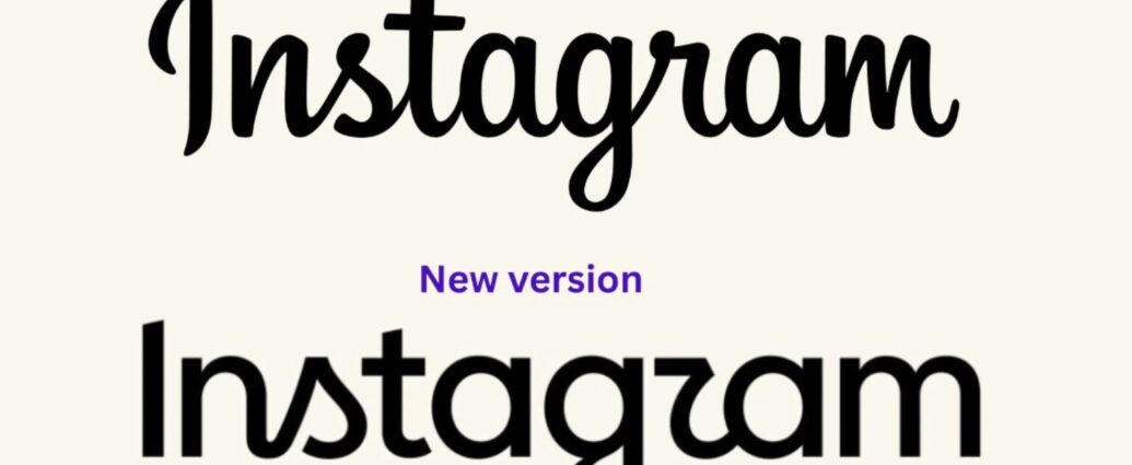
Instagram made a subtle change this last week, but if you’ve opened the app recently, you may have noticed it immediately. The app icon is still the same colorful camera we’ve all come to recognize. The colors haven’t changed either. Instead, Instagram updated its wordmark, the handwritten-style logo that spells out “Instagram” throughout the app and in its branding.
At first glance, it might seem like a small design tweak. But when one of the world’s most recognizable brands changes part of its identity, people notice. The redesign has sparked plenty of conversation online, with everyone from graphic designers to everyday users weighing in on whether the update was necessary or if Instagram should have left well enough alone.
What Actually Changed?
If you’ve seen headlines saying Instagram has a “new logo,” it’s worth clarifying what actually happened.
Instagram did not redesign its app icon. The familiar gradient camera icon remains unchanged, which means most people won’t notice any difference on their home screen. The update is specifically to the Instagram wordmark, the script logo that appears within the app, on marketing materials, and throughout the company’s branding.
The new version keeps the handwritten feel of the original, but the lettering has been refined with smoother curves, slightly different spacing, and a more modern appearance. It’s a subtle evolution rather than a complete redesign, but when a logo has been part of our daily lives for more than a decade, even subtle changes stand out.
Why Did Instagram Change It?
According to Instagram head Adam Mosseri, the previous wordmark had been in use for roughly ten years. As the platform has evolved from a simple photo-sharing app into a place for videos, messaging, shopping, creators, and AI-powered discovery, Instagram felt its visual identity should evolve as well.
The redesign is also part of a broader branding update. Along with the new wordmark, Instagram has been introducing updated typography across its products to create a more cohesive visual system. Rather than changing one logo in isolation, the company is modernizing the overall look and feel of the brand so its design language feels more consistent everywhere people interact with Instagram.
Whether people love the new look or not, it’s clear the goal wasn’t simply to replace a logo. It was to refresh the brand in a way Instagram believes better reflects where the platform is today.
The Internet Has… Thoughts
As you might expect, the internet didn’t quietly accept the change.
Some users have said the redesign feels unnecessary, especially since the previous wordmark had become so recognizable over the years. Others don’t mind the update at all and see it as a natural evolution for a company that’s constantly changing. Designers have also been divided, with some appreciating the cleaner typography while others argue the new version sacrifices some of the personality and readability that made the original iconic.
One of the more humorous reactions has been people joking that the new lettering reads “Instagzam” instead of Instagram. Whether you see it or not, the nickname quickly spread across social media and became one of the most talked-about parts of the redesign. It also demonstrates just how closely people pay attention to familiar branding, even when the changes are relatively small.
The Bigger Question for Business Owners
As interesting as the redesign is, I don’t think the biggest lesson is whether Instagram made the right choice. The question I keep coming back to is this: When should a business refresh its brand, and when should it leave something iconic alone?
That’s a much more useful conversation for the rest of us.
Not every business needs a rebrand simply because a few years have passed. Sometimes consistency is one of your greatest marketing assets. If customers instantly recognize your logo, colors, or visual style, changing those elements can create confusion unless there’s a clear reason behind the decision.
On the other hand, there are times when a brand genuinely outgrows its original identity. A thoughtful refresh can communicate growth, clarify your message, or better represent the business you’ve become. The important part is knowing why you’re making the change.
Brand Recognition Is Worth Protecting
One thing I always encourage business owners to remember is that you’re around your brand every single day. Your audience isn’t.
It’s easy to grow tired of your own logo because you see it constantly. That doesn’t mean your customers are tired of it. In fact, what feels old to you may still be the very thing that helps someone instantly recognize your business.
Personally, I’m in the camp that thinks some iconic brand elements earn the right to stay. I understand why Instagram wanted to modernize its visual identity, but I’m not convinced this particular change makes the brand stronger. It also reminds me that as business owners, we shouldn’t redesign simply because we’re tired of looking at something our audience already recognizes.
Evolution is often better than reinvention, especially when you’ve already built trust and recognition over time.
Final Thoughts
Whether you love Instagram’s new wordmark or wish they’d left it alone, one thing is certain: even small branding decisions can spark big conversations.
For me, that’s the most interesting part of this story. It reminds us that branding isn’t just about creating something attractive. It’s about creating something people recognize, remember, and connect with. That’s why every design decision should solve a problem, support your business goals, and strengthen your identity rather than simply following the latest trend.
If there’s one takeaway I’d leave you with, it’s this: don’t change your branding just because you’re ready for something new. Change it because your audience will be better served by the business you’re becoming.
Want More Marketing News That Actually Matters?
If you enjoy breaking down social media new & strategy, I’d love to invite you to join The Daily Pour. Every edition includes the social media updates worth paying attention to. Plus, you’ll get practical marketing insights, and simple ideas to help your business become more searchable online.
If you’re wondering how to build a brand that’s recognizable both visually and in search, you might also enjoy reading Three Ways to Make Your Website Easier to Find This Week. It’s filled with practical strategies you can start using right away.
FAQ
What changed in Instagram’s new branding?
Instagram updated its handwritten wordmark, which appears throughout the app and in its marketing materials. The familiar app icon and color gradient did not change.
Why did Instagram update its wordmark?
According to Adam Mosseri, the previous wordmark had been in use for about a decade. The redesign is part of a broader effort to modernize Instagram’s visual identity and create a more consistent design system across the brand.
Why are people calling it “Instagzam”?
Some users feel the new lettering makes the wordmark slightly harder to read, leading to jokes online that it looks like it says “Instagzam.” The nickname quickly spread across social media as people reacted to the redesign.
Should small businesses update their branding regularly?
Not necessarily. A brand refresh should solve a specific problem or reflect a meaningful change in your business. If your branding is already recognizable and serving your audience well, consistency is often more valuable than change.


1 Comment